
Effectiveness/Efficiency In Horror Posters
Mama
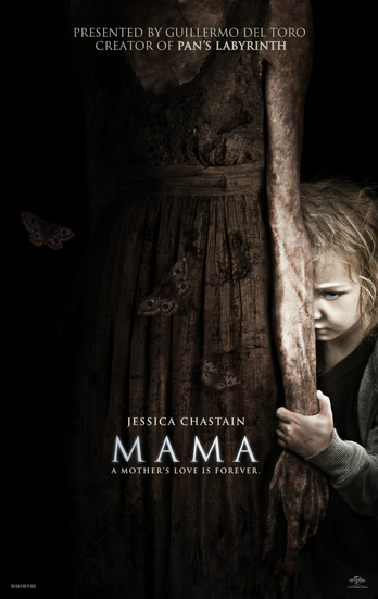
When seeing this poster the first thing that comes to mind is the connection seen between the young girl and the "abnormal" being that is called "Mama". This is very interesting to see and catches the viewer's attention straight away as usually you wouldn't see a type of bond between the victim and the thing we associate as a predator- furthermore this poster shows a lot of innocence as the young vulnerable girl is seen gripping Mama in a way that makes us think that she loves her. The innocence is highlighted through the use of colour on this poster, towards Mama and the left you see darkness- as you get closer and closer to the young girl it gets lighter and she is almost highlighted which yet again leaves you with an indecisive opinion, there is a clear separation being highlighted and this shows contrast, whereas you could also argue that they seem to share some sort of love for each other and and a bond/relationship.
Furthermore, we can also infer from the white font that there is a theme of purity and innocence- usually red is used in horror films to highlight danger and death, however with this theme of innocence it's a very clever way which contradicts the stereotypical- in a strange way it's almost as if life is meeting death for a change rather then the other way around like most other horror storylines are betrayed. This is unique because for once you don't necessarily view the "bad guy" as being bad, you see this innocence and it is shown through the way this poster is presented.
The butterflies that are seen on Mama also add another interesting point to the unique innocent theme in this poster- butterflies usually hide and stay on things where they feel safe- this shows Mama as being a safe haven and a mother figure. Yet these butterflies could also symbolise something much deeper- the butterflies could be a metaphor for the little girl- this could be a way of saying that the girl hasn't known anything better in her life and the innocence of her so called "Mama" remains very appealing, it shows Mama in a shield of clouded innocence in the eyes of her young victim.
Doll Face
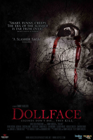
Dollface follows the majority of the other horrors when it comes to posters, the classical approach of using dark colours, mainly black and grey- but with using some standing out colours such as red and white which represent interesting aspects that may refer to death, purity, innocence and blood shed. All of these themes are consistent throughout the horror industry- and you can clearly see how it is presented in this poster; with the use of a black background with a white face emerging from it- it reminds you of a darkness that has arisen. The face is presented as cracked and with tears of blood coming down the side of the face- this could indicate a type of innocence, pain and sadness, the cracks in face could also symbolise parts missing in the troubled spirit's past life- that there is some unfinished business and therefore their spirit is not at peace.
The short reviews towards the top left have been put in the colour white- they have used the colour white as this may seem more appealing for viewers who aren't so keen on horror films- the colour white doesn't seem as scary as red- it's a very clever way to use colours like this as this automatically triggers a feeling of innocence to the audience therefore they will think the film is harmless and not scary; however, the title is very clear, it;s in red and appears to be following the theme of blood- which is fairly obvious when it comes to horrors. The use of white is furthermore used in the tag line "Legends don't die... They kill".
The short reviews towards the top left have been put in the colour white- they have used the colour white as this may seem more appealing for viewers who aren't so keen on horror films- the colour white doesn't seem as scary as red- it's a very clever way to use colours like this as this automatically triggers a feeling of innocence to the audience therefore they will think the film is harmless and not scary; however, the title is very clear, it;s in red and appears to be following the theme of blood- which is fairly obvious when it comes to horrors. The use of white is furthermore used in the tag line "Legends don't die... They kill".
Rings
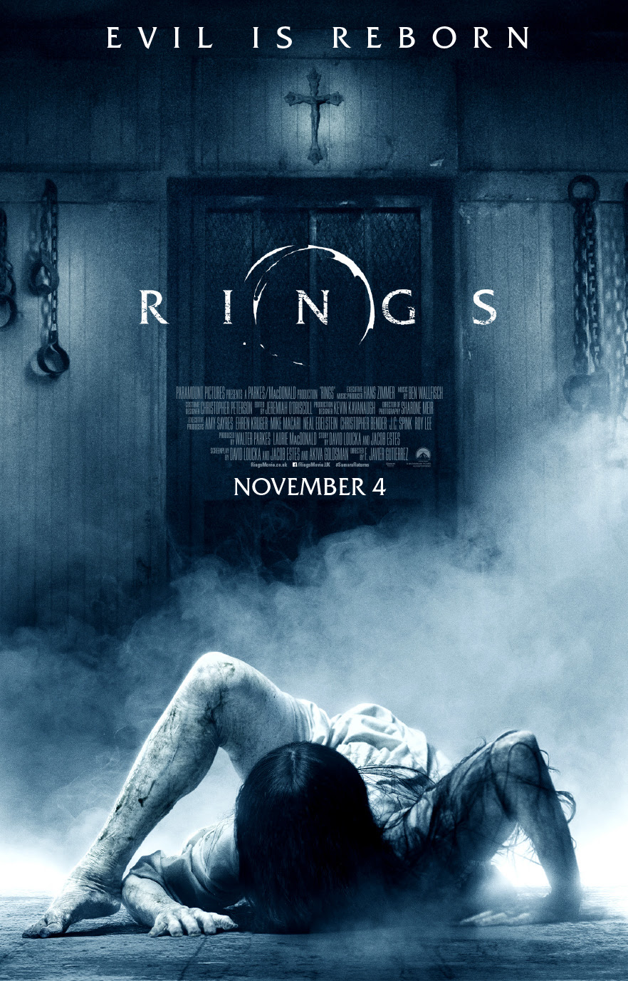
Rings is quite a unique poster when it comes to horror- at first glimpse you see what everyone sees- you see an extremely disturbing individual with a seriously messed up form; however looking more into it this poster shows much more than a symbol of horror. Given the shape of the individual you can make a decision based on two theories- she is a horrific creature with no place and should not be seen as anything but that, or is the case of an individual who is broken and seeks help? Relating this subject to the title of the film "Rings" we can furthermore begin to build up a picture of innocence. Rings are usually a symbol of marriage and people being happy and together however this individual is showing something broken, juxtaposing the initial ideology based around it all. Going further into depth on the more evident features of the poster, the colours used are fairly simplistic and easy to read- the whole image is a metaphorical representation of this young woman's life, a simple human life no different to any body else's. The white smoke could represent an innocent but clouded judgement- it could also represent the fact that it isn't easy to see why this individual is troubled- giving this movie poster a mystery effect. In addition, there are chains attached to the wall in the background- this suggests that this individual may have been oppressed and subdued against her own will- to top it off the cross of christianity is seen to be placed above all else- it's an extremely interesting feature as you could be questioning who the devil really is? Was religion the cause of this ladies suffering? Was religion covering the true horrors of life... or even creating them perhaps?
