Examples of Production Companies:
When creating our production company logo, we looked to real-life examples for inspiration, and here is what we learned:
Twisted Pictures
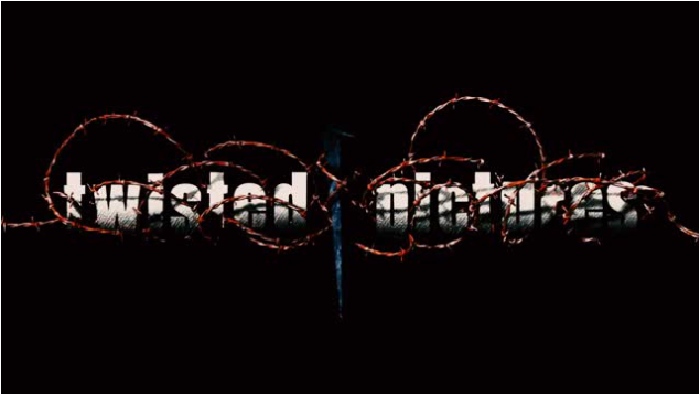
The first production company we looked at was Twisted Pictures, best known for Saw I - VII. This production company is one of the most famous and successful horror production companies, making terrifying films with a relatively low budget.
The imagery used here is minimalistic, simple, and dark. This makes this logo effective as it stands out from plain black background, which has connotations of death, and mystery. Sound effects and animation are used to shock the viewer, with explosive sounds and sudden, abrupt animation styles that surprise the viewer.
The word 'twisted' suggests the dark, disturbing nature of the films that this company makes, and coincides with the twisting animations shown on the vines and the thorns - almost as if it is strangling the viewer.
Imagery here, such as the thorns, and the vines that entangle the text, create a claustrophobic feeling for the viewer, and a feeling of danger. Due to all of these features the viewer immediately knows that the genre of film that this production company will make, because of the disturbing nature of the logo.
Blumhouse Productions
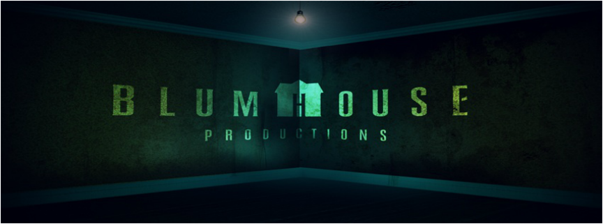
Next, we looked at Blumhouse Productions, who are well known for Paranormal Activity, a film that brought the found-footage style of filming to the mainstream, and has been replicated by many other production companies. This company also worked on a low budget for the film that made them famous.
Before showing this main logo, conventional horror imagery is used; a floating chair, a possessed girl, and a blood splatter. This fast pace between the shots is used to create a sense of urgency and panic, associating them with their films, which are often based on panic and fear of the unknown, such as Paranormal Activity.
The use of colour in this logo is note-worthy, the use of greens and blues rather than traditional reds and blacks. This gives the logo an eerie, supernatural or even extraterrestrial theme, rather than the bloody imagery or dark imagery used in other logos.
Once again, minimalist imagery is used for this logo; an empty room with nothing but a single light bulb.
This adds to the feeling of emptiness, but giving the viewer the unnerving feeling that they are not quite alone. The flickering light also suggests another presence in the room.
Ghost House Pictures
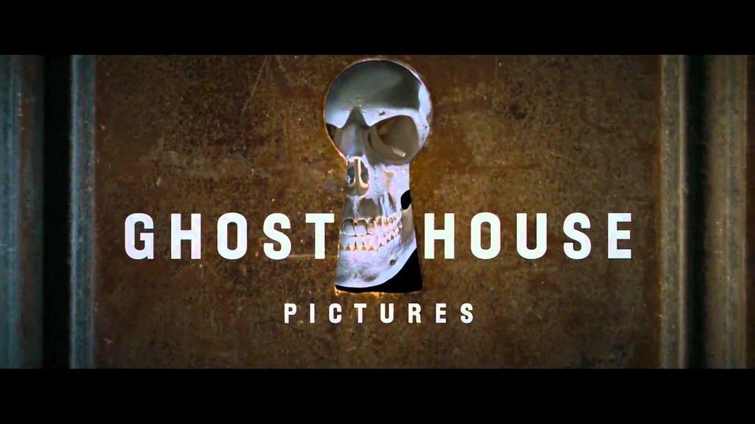
The final production company we looked at before making our own was Ghost House Pictures. I feel that this logo was perhaps the most effective in showing purpose to the viewer, as it the most explicit. The imagery of the door slamming, and the skull jumping onto the screen are very stereotypical horror conventions, and because of this the viewer immediately knows that this company is focused on horror films.
Even this logo is minimalistic, with the only imagery on screen being the skull and the door frame; making the viewer feel that they are alone. This is a central theme in the production company logos that we looked at, as isolation is key to horror films, and creating suspense.
The slow to fast pace creates suspense, as the door slams and the iconic skull pops up.
Ghost House Pictures are well-known for their work on The Grudge, and Poltergeist (2015), and was founded by Robert Tapert, who also founded Renaissance Pictures,
Our Production Company Logo
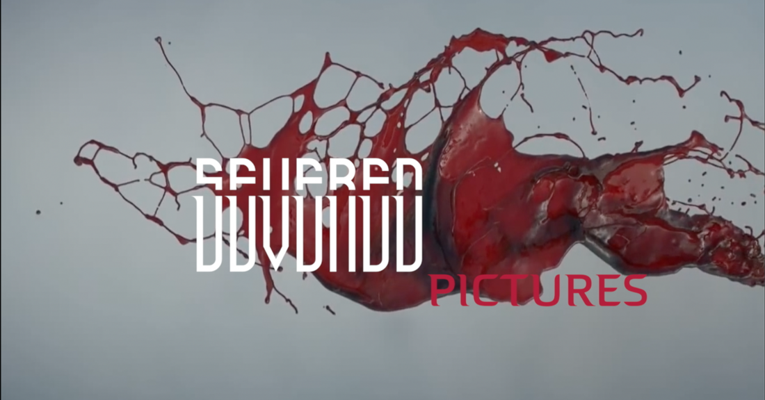
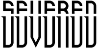
We didn't want to choosing to use an existing production company for our trailer scissors, as a group wanted to create and use our own production company. Severed Pictures is our own production company and the term "severed" tells the audience a bit about our trailer as out trailer is about killing and severed means to cut so it sort of gives a hint into our film and what it will be about.
