How Effective is the Combination of Your
Main Product and Your Ancillary Texts?
PART I: Branding

|
|
When creating our media texts, we sought to create a strong, memorable brand that would feature across both our trailer and our two ancillary texts; our movie poster and our magazine cover.
Iconic Image
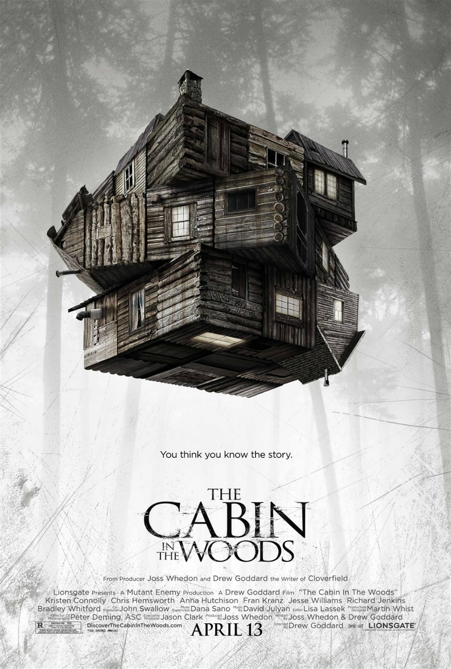
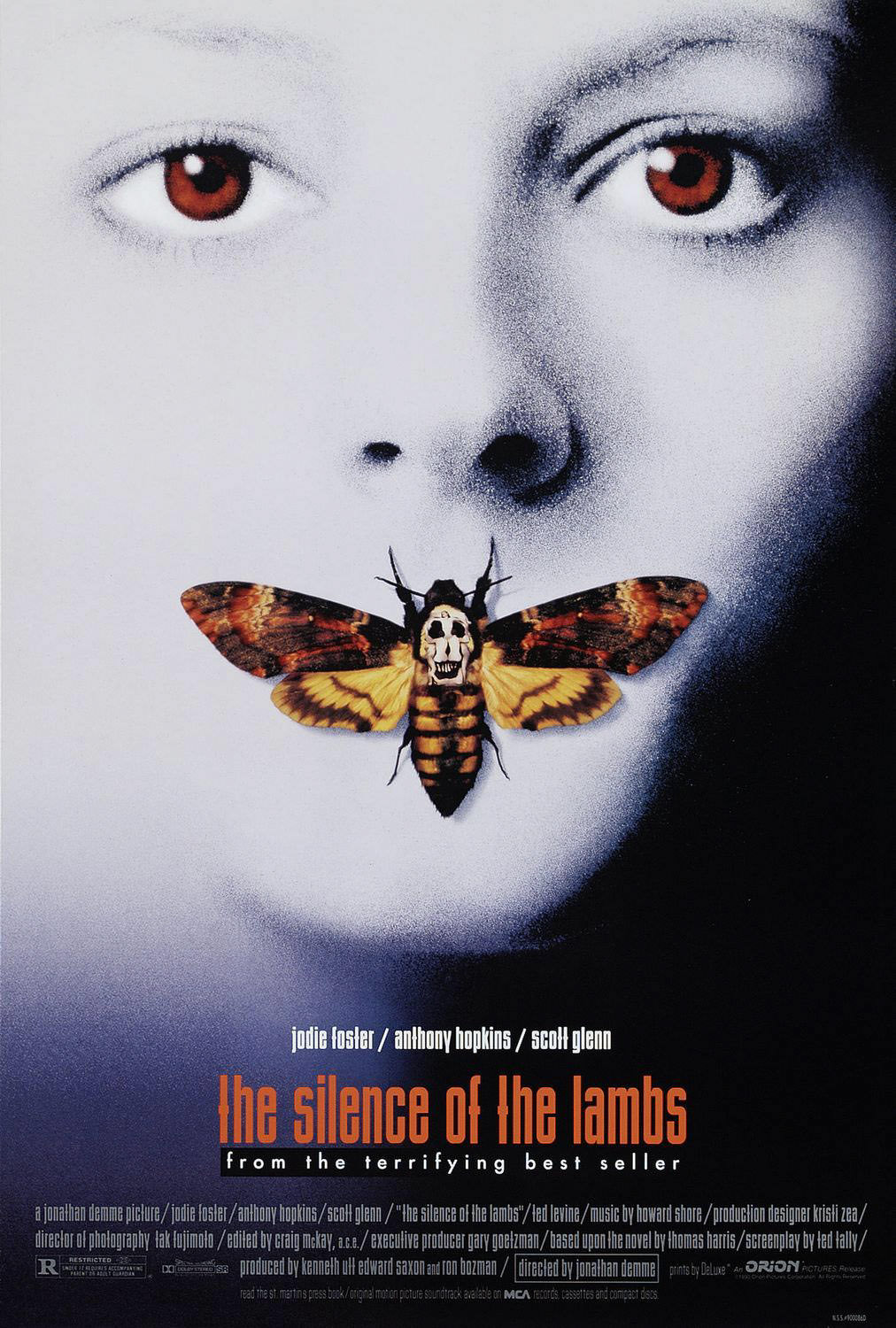
The Cabin in the Woods (2011), The Silence of the Lambs (1991)
|
|
During our research, nearly every horror movie poster that we studied contained one central element; an iconic image that epitomises the brand. This is an image that will represent the film and often becomes the central part of the brand, not only the literal centre of the poster.
For example, Jonathan Demme's The Silence of the Lamb's features a woman with a moth over her mouth - the signature of the movie's killer. The image itself is not complicated, instead relying on simplicity and the absence of colour (excluding the moth & eyes) to capture attention. The Cabin in the Woods poster similarly features little more than the titular cabin.
By offering the viewer one central image to focus on, even a casual audience will be able to engage with the brand. As such, we aimed to include certain elements of mise en scene, that would feature throughout our trailer and ancillary texts. When seen, these assets are identifiable and recognisable to the viewer, tying together the three elements of our brand.
Movie Poster
Original Image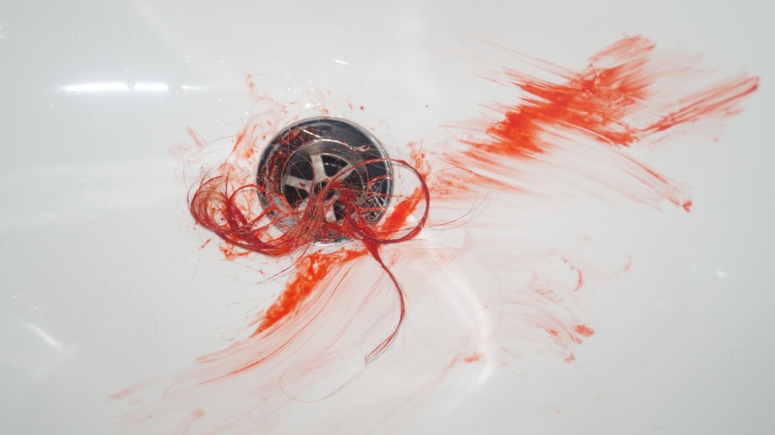
|
Final Poster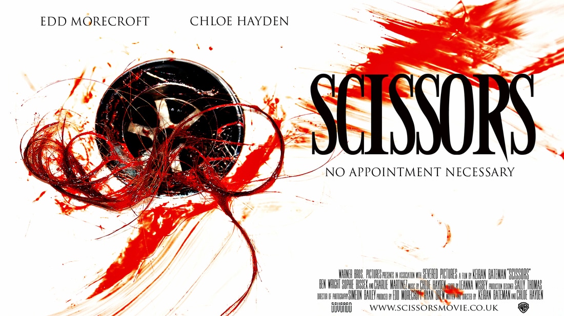
|
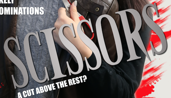
In keeping with our two other media texts, we aimed to keep our movie poster minimalistic in both production and style. Often, in film, most posters are heavily edited, with a focus on computer-generated effects. In the creation of our poster, we used image editing software, such as Photoshop, sparingly; using it only to add a filter to whiten the background and make it appear like a sink. This also provided a further contrast with the blood and plug, allowing them to become even more visible at the forefront of the image.
Iconic Magazine
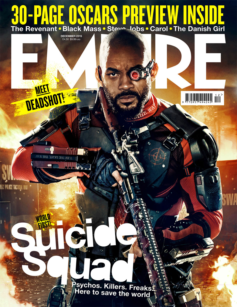
|
Empire is the biggest selling film magazine in the UK, and features articles on film news, reviews, and previews. It aims to be populist and inclusive, and as such features both feature and art films.
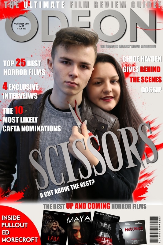
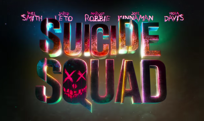
The magazine cover is heavily edited, in order to capture the attention of whoever views it. This is achieved through the representation of one of the main characters of the film 'Suicide Squad' in the centre foreground, with CGI fire faded into the background. This particular issue also includes a 30-page Oscars feature, which inspired a similar feature of our own cover; a '10 Most Likely CAFTA (Churchdown Academy Film & Television Awards) Nominations'. The inclusion of features such as these is commonplace on magazine covers, as it offers further incentive to buy the magazine, beyond that offered by the main cover focus. The amount of text featured on this cover is minimal, in order to keep attention focused on the central image. This something we followed only loosely, as we included more, short pieces of text to entice the audience further still. The cover also offers a strong representation of the film franchise, with the main text depicted in the style found within the trailer for 'Suicide Squad' (see left). We utilised this on our own cover, using the same text font as was used in our trailer - making it both recognisable to the audience and inclusive of the brand. |
Magazine Cover

|
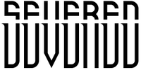
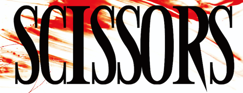
For example, we were keen to carry over fonts from our trailer to our ancillary texts. The 'Scissors' logo is the centrepiece of our cover, and this is no accident. It is designed to create a synergy between the trailer and cover; a familiar sight for the viewer.
The blood smears in the background, behind the characters, should also appear familiar, as they are lifted directly from our poster image. However, we corrected the colour in order to appear fuller, less washed out than on the poster. The magazine cover also follows a minimalistic theme that runs throughout our media texts, while the film magazine 'Odeon' adds a sense of realism to the cover. |
Recurring Imagery
|
|
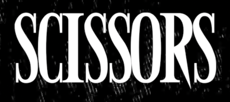
It was important for us to create a strong brand for our film. In order to do this, we used one, distinct font to create the logo; which was featured across all three of our media texts, with only a slight variation in colour. We felt that this font, with its sharp edges, was the best choice to feature across our texts, as it is distinct enough to be easily recognisable to even the casual viewer.
